
Radio-Canada has many audiences, and all of them come to the same platform.
On its 80th birthday, Radio-Canada decided to undertake one of the biggest redesigns of all of its platforms. Created with flexibility and versatility in mind, a new design system had to standardize assets of every product the national broadcaster was offering to its french audience.
Early in the process, Canadians shared that Radio-Canada’s content offering seemed to be hindered by the difficulty of which it was to access. The content was here, and it was produced locally, but the digital platforms lacked a sense of unison and users were lost.
Elaborate integration
Bridging the gap between design and development with the design system enables the design team to bring a sense of cohesiveness to all of Radio-Canada's platforms. Every HTML element is styled with WCAG 2.0 AA standards, with variables that can be adjusted for both extra-large screens and extra-small mobile devices.
Branding and UI
Every variable within the design system was closely related to the Radio-Canada brand. As such, the system had to answer not only marketing and communication standards, but also digital ones. Accessibility, ease of use and readability were the main focus points for the implementation of the new design system.

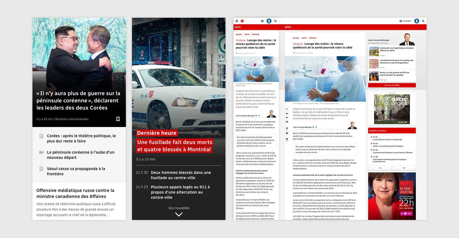
The news card
Radio-Canada has a huge offering. Publishing over 400 news articles a day, the team was challenged to find a way to represent the equivalent of an ever-changing encyclopedia to the user.
So how did we tailor the experience? The team decided to pick the most used component, the news card, and looked into how the experience around this module could be extrapolated to create a streamlined navigation across digital platforms.
Our favorite component was created after analyzing user behaviour through research, analytics, and surveys. All agreed: the most important piece of information was the title, a supportive image, and only then, secondary information such as the journalist’s name or the news category. Everything else was considered secondary, and from there, we created the basic news card component.
Content density
Depending on the platform, users shared that they had specific expectations when it came to consuming information.
What we called News Junkies were adepts of hard news. Their experience meant to be linked to high-density, text-dependent content with limited, but important, space reserved for imagery.
Other users who were more invested in entertainment channels strongly linked their TV-viewing habits with their online expectations, and had a strong propension for quick access to videos, TV scheduling and extra content found online.
The news card had to be versatile. We planned the component’s lifecycle to be integrated into new types of platforms where density and content strategy would be different. For example, the Sports section had an editorial segment where storytelling justified the use of high-impact visuals that needed to shine whilst remaining within Radio-Canada’s comprehensive navigation stream.


The Radio-Canada Typeface
Working closely with typographer Charles Daoud, Coppers and Brasses and Alexandre Saumier Demers, we created a typeface that would forge itself into the Radio-Canada brand.
Radio-Canada is the national broadcaster. This means all Canadians have the right to access its content. Just as newspapers designed their own type for readability and density, the Radio-Canada typeface was designed with Canadians in mind. Unpretentious and easy to read : these were the two main objectives, and qualities, that were put forth during the font’s conception.
The typeface had to be subtle enough to work well in more serious news or financial contexts but also have enough personality to allow it to stand out in more display uses such as creative applications advertising. On top of all that, it had to perform equally well on paper and on screen, in small and not so small sizes.
Building the library
An often asked question around design systems is how do we achieve flexibility while remaining relatively strict in the usage of such a system. We put in place a DesignOps team that became the owner of the design system. By having dedicated people maintaining the system, we had the opportunity to integrate the idea of openness and endless improvement.
Each component is crafted with multiple bases and elements, which can change over time and skew the Radio-Canada brand as the national broadcaster evolves with time.
The design system also enabled the team to quickly assemble new pages, or mockup high-fidelity prototypes for user-testing. With the integration of DesignOps at Radio-Canada through the design system and modern technology stacks, we were able to approach the fabled pixel-perfect dream.

Timeline
October 2016 and ongoing.
Role
Senior Manager, Design and UX at Radio-Canada
Team
Julie Desilets, Marjorie Lazaro, Olivier Fortin, Yoann Jailin, Zhuzi Cui, Mathieu Côté, Stéphanie Dorval, Linda Hersant, Gabrielle Fiola Masson, Stéphanie Francoeur, Jean-François Bastien, amongst many, many others.